For this mini project, I researched problems with the UX and UI of on boarding screen for the original Hunter mobile app, and then created a new on boarding process and interface.

Original Screen
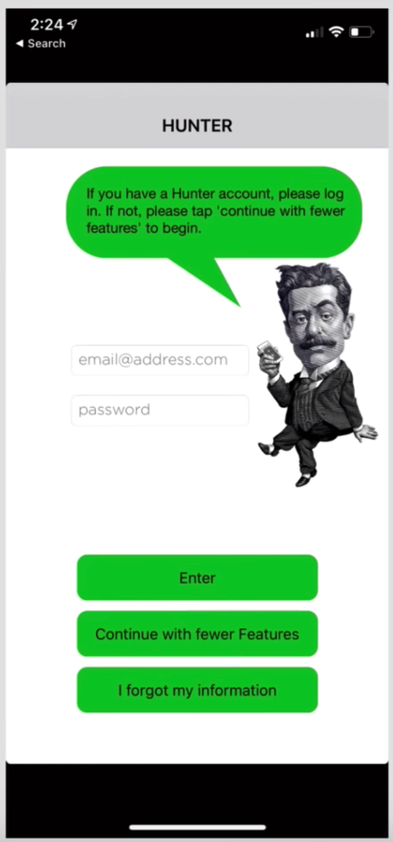
The original design has many design and user experience issues. The logo is small, and doesn’t match the website logo. This loses the connection to the Hunter brand, and is visually confusing to the user. The buttons are the same size and color, there is no hierarchy between them making the path through the screen unclear to the user. The sign in section could be a separate page that the user is guided to in the on boarding process.
First Redesign Draft


The first draft fixed some hierarchy issues and added appeal to the interface, but more contrast could be used to create further hierarchy and highlight the most important elements.
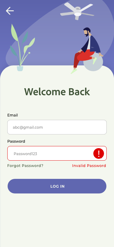
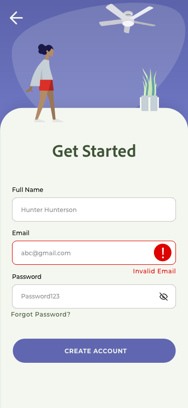
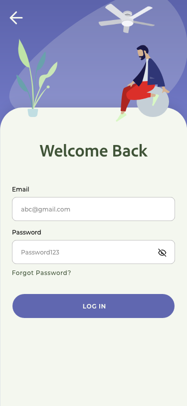
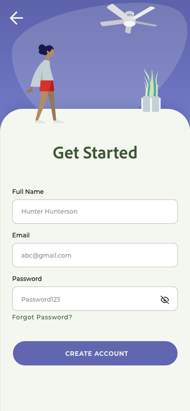
Final Version